西里尔字符_如何设计西里尔字母Њ(Nje),Љ(Lje),Ћ(Tshe)和Ђ(Dje)
西里尔字符
This article is about how to design Cyrillic characters Њ, Љ, Ђ, and Ћ (upright caps and lowercase; italics are not covered here). They are often problematic since they are Cyrillic, but not found in the Russian alphabet, so there is no much reference and guides how they actually should look. Њ and Љ are used in Serbian and Macedonian, while Ђ and Ћ only in Serbian. Here is my research and opinion as a native Serbian speaker/reader.
本文介绍如何设计西里尔字母Њ,Љ,Ђ和Ћ(大写和小写;斜体不在此处)。 由于它们是西里尔字母,因此经常会出现问题,但在俄语字母中找不到,因此没有太多参考和指南,它们实际上应该如何显示。 Њ和Љ用于塞尔维亚语和马其顿语,而Ђ和Ћ仅用于塞尔维亚语。 这是我作为母语塞尔维亚语/读者的研究和观点。
Please take this as an opinion rather than a hard rule. The article tries to find out what is the default. These characters could be a subject of creative experimentation, like any other character in the typeface. The idea is to establish a solid starting point, not to limit creative freedom.
请将此视为一种意见,而不是硬性规定。 本文试图找出默认值。 与字体中的任何其他字符一样,这些字符可能是创造性实验的主题。 这个想法是建立一个坚实的起点,而不是限制创作自由。
In images I have used my font Naslof, as well as these great fonts from other type designers: Resavska, Adamant, Noto Sans, Fira Sans. Sorry in advance for possible writing and language mistakes.
在图像中,我使用了Naslof字体,以及其他字体设计师的出色字体: Resavska , Adamant , Noto Sans和Fira Sans 。 抱歉,可能会引起写作和语言错误。
Њ— Nje —(大写U + 040A,小写U + 045A) (Њ — Nje — (Capital U+040A, Lowercase U+045A))
-The first, and probably most often wrongly designed is Њ. It’s the soft variant of classic N, and sounds like the N in “New”, compared to classic N in “Now”. Latin counterpart would be Spanish Ñ. The look of the glyph was invented by Vuk Stefanović Karadžić, turning Cyrillic N (looks like Latin H) and Russian soft sign Ь into one ligature glyph. But during the time the perception of the grapheme evolved, so it is considered as a separate glyph, not as a ligature. Writing movement using three strokes also suggests it’s a glyph per se. This fact influences the design of Њ.
-第一个,可能是最经常错误设计的是Њ。 这是经典N的柔和变体,与“现在”中的经典N相比,听起来像“新”中的N。 拉丁文对应为西班牙Ñ。 字形的外观由VukStefanovićKaradžić发明,将西里尔字母N(看起来像拉丁字母H)和俄语软符号Ь变成了一个连字形字形。 但是在此期间,对字素的感知在发展,因此它被视为独立的字形,而不是连字。 用三个笔画书写动作也暗示它本身就是一个字形。 这个事实影响design的设计。
The first step is to make H and Ь part a bit narrower, to avoid Њ look too wide. Second — and the most important thing here — is to ensure that the horizontal bar of the H part and upper part of Ь bowl look like a continuous line. Often — even in high-quality professional typefaces — this is not the case. A simple morph of H and Ь, in the vast majority of cases, will not do the job, since the bowl of Ь is usually significantly higher than H bar.
第一步是使H和Ь部分变窄,以避免to看起来太宽。 第二点,也是这里最重要的一点,是确保H部分和bar碗上部的水平条看起来像一条连续线。 通常-即使是高质量的专业字体-并非如此。 在大多数情况下,H和simple的简单变体将无法胜任,因为bowl的碗通常显着高于H bar。
To remedy this, H bar goes a little bit up, and the upper part of Ь bowl goes a little bit down. The goal here is to make them “appear” as a continuous line, but in fact, they will probably still be slightly misaligned in order to soften the change and keep them look as similar as possible to the original H and Ь. Also, the H bar is usually a bit thicker than the top horizontal of Ь bowl, and you can keep this small difference.
为了解决这个问题,H杆略微升高,Ь碗的上部略微降低。 此处的目标是使它们“连续显示”为一条连续的线,但实际上,它们可能仍会略有偏离,以使更改更柔和并使它们看起来与原始H和similar尽可能相似。 另外,H形通常比Ь碗的顶部水平线稍厚,您可以保持这种小的差异。
Speaking of bar/bowl stroke thickness, maybe it is a good idea to make Њ bar slightly thinner than H bar, and top bowl horizontal of Њ slightly thinner than in Ь, especially in heavier font weights, to avoid the congestion of black at this “4-ray” crossing.
说到条形/碗形的笔划厚度,最好使Њ形比H形稍薄,使top形的上碗水平比bar形稍薄,尤其是在较粗的字体上,以避免在此出现黑色的拥塞。 “四线”穿越。
A good thing while designing Cyrillic is that lowercase (for upright) is basically a small caps most of the time, so the lowercase њ follows the logic.
在设计西里尔字母时,一件好事是,小写字母(对于直立式)在大多数情况下基本上是一个小写字母,因此小写字母њ遵循逻辑。

Љ— Lje —(大写字母U + 0409,小写字母U + 0459) (Љ — Lje — (Capital U+0409, Lowercase U+0459))
-
--
Љ is softened L. It’s a bit hard to find the example of the sound in English, but there is a lot of it in Spanish in form of double L (for example the word “caballero”). Following the logic of Њ, the origin of the grapheme is composite, adding soft sign Ь to the Cyrillic letter Л (L), but again it’s rather considered as a character by itself than a ligature.
Љ是柔化的L。很难找到英语的声音示例,但是西班牙语中有很多双L形式的声音(例如单词“ caballero”)。 遵循the的逻辑,字素的原点是复合的,在西里尔字母Л(L)上加上了柔和的符号but,但它本身还是一个字符,而不是连字。
Both L and Ь parts are a bit narrower. As for the bowl, here we don’t have the constraint of the horizontal bar as for Њ, but still want to keep these two consistent. That said, it’s usually the same as on Њ, but it’s ok to go a bit higher (sometimes also a bit wider) than that. Anyway, it’s most often closer to the Њ than Ь bowl.
L和Ь部分都较窄。 至于碗,这里我们没有Њ的水平条约束,但仍然想使这两个保持一致。 也就是说,它通常与Њ上的相同,但是可以比它高一点(有时也宽一点)。 无论如何,它通常比碗更靠近碗。
The lowercase is small-cap again.
小写字母再次变为小写。

Ћ— Tshe —(大写U + 040B,小写U + 045B) (Ћ — Tshe — (Capital U+040B, Lowercase U+045B))
-
--
The last letter of many Serbian last names, like “Djoković”, i.e. Sounds like “ch” in the Spanish word “muchacho”.
许多塞尔维亚姓氏的最后一个字母,如“Djoković”,即西班牙语单词“ muchacho”中的听起来像“ ch”。
The glyph is based on Cyrillic Ч rotated for 180 degrees. Because we have a horizontal bar (at the top), the arch tends to go a bit lower — especially in heavier font weights. Often, the counter is also a bit narrower, but the change in this direction is smaller than that in a vertical direction.
该字形基于旋转180度的CyrillicЧ。 因为我们有一个单杠(在顶部),所以拱形趋向于降低一点-特别是在较粗的字体中。 通常,计数器也变窄一些,但此方向的变化小于垂直方向的变化。
The top bar is most often a bit narrower than that on T, and it’s moved to the right. As a starting point in regular font weight, you can place the right bar terminal at about 90% of the counter width (it can go a bit left and right from that). In heavier weights — as the counter shrinks — right bar terminal falls more toward the right stem, but not beyond the middle line of the stem width (approximately). The placement of the bar left terminal also varies, but it’s placed so the bar is narrower than T bar, and not too much to the left to avoid spacing problems. The bar could be a bit thinner if needed, to keep enough amount of white space between the bar and arch.
最上面的栏通常比T上的栏窄一些,并且向右移动。 作为常规字体粗细的起点,您可以将右侧条形端子放置在计数器宽度的大约90%处(它可以左右移动一点)。 在较重的重量中(随着计数器的收缩),右杆端子向右茎的下降幅度更大,但不超过茎宽度的中线(大约)。 钢筋左端子的位置也有所不同,但是放置的位置是使钢筋比T钢筋窄,并且不要向左倾斜太多以避免间距问题。 如果需要,该杆可能会更细一些,以在杆和拱之间保留足够的空白空间。
There is a variant of the Ћ without part of the bar on the left side. It can be often seen in informal handwriting, but it’s rare in type design. The advantage of this variant is a better spacing on the left side, while the disadvantage is more problematic bar-arch relation (because bar now has to go further to the right to balance the absence of the left part portion, which closes this tight space additionally). But if there is enough space, I would personally like to see it more often. I would say it’s more convenient for modern/geometry/eclectic typefaces.
Ћ的一种变体,左侧不带部分条形。 它通常可以在非正式手写中看到,但在字体设计中很少见。 此变体的优点是在左侧具有更好的间距,而缺点是杆-拱关系更成问题(因为杆现在必须进一步向右移动以平衡左侧部分的缺失,从而封闭了狭窄的空间)另外)。 但是如果有足够的空间,我个人想更经常地看到它。 我想说这对于现代/几何/折衷字体来说更方便。
Lowercase ћ is actually h with the crossing bar. Most often in the regular weight, it has the arch identical to the h, but I think that slight lowering is ok if needed, because usually we have even less space between the bar and arch than for caps. However, the amount of lowering should be inside the range of optical correction, and should not compromise x-height alignment too much. This lowering is usually needed as the font weight increases, anyway.
小写字母actually实际上是带有横杠的h。 通常,在常规重量下,它的拱形与h相同,但我认为,如果需要,可以略微降低,因为通常我们在拱形和拱形之间的空间比帽盖还要小。 但是,降低量应在光学校正范围之内,并且不应过多影响x高度对齐。 无论如何,通常都需要随着字体粗细的增加而降低。
The bar is very similar to that found on crossed d (đ, U+0111), which means it’s probably a bit thinner than t bar (more obvious at low contrast typefaces). On the right side, it’s aligned somewhere near the top node of the arch. On the left side, it extends similar to t. Its vertical position is centered slightly below the middle of the “ascender-top of the arch” distance (again having enough bar-arch distance is very important, and it’s often too tight in the existing typefaces).
竖线与交叉的d(đ,U + 0111)上的竖线非常相似,这意味着它可能比t竖线更细(在低对比度字体中更明显)。 在右侧,它对准拱顶节点附近的某个位置。 在左侧,它的延伸类似于t。 它的垂直位置稍微居中于“拱顶”的中间位置(再次具有足够的直拱距离非常重要,并且在现有字体中通常太紧)。

Ђ— Dje —(大写字母U + 0402,小写字母U + 0452) (Ђ — Dje — (Capital U+0402, Lowercase U+0452))
-
--
The first sound of the surname “Djoković” i.e. Sounds somewhat like the first sound in the word “Jaw”.
姓“Djoković”的第一个声音,即听起来有点像单词“ Jaw”中的第一个声音。
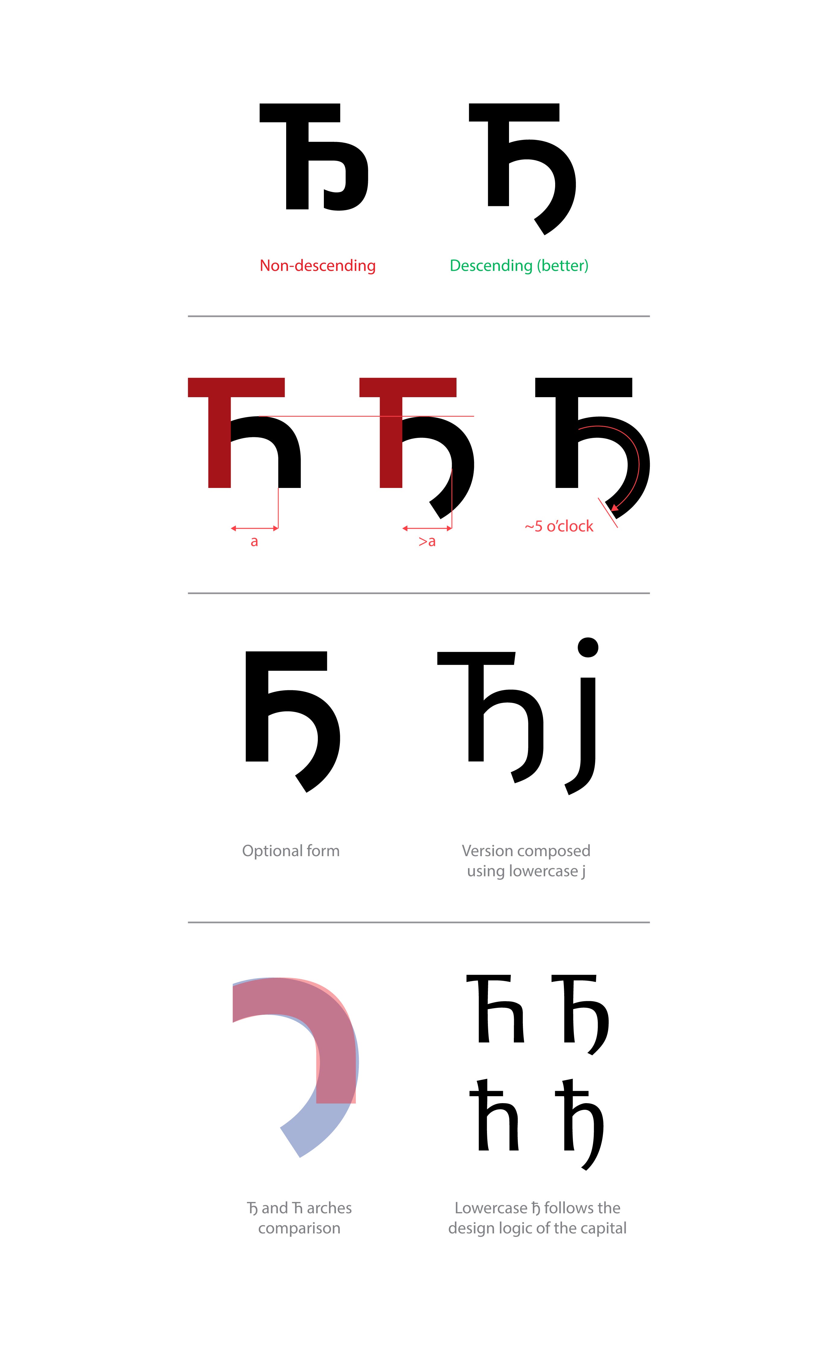
You can start from Ћ editing the right stem. There are two main variants of capital Ђ: “descending” and “not descending”. Both are accepted and used, but I am really not the fan of the “not descending” since it curls into the bowl at the baseline, being too close to capital Б and not different enough from Ћ. Especially in the case where we already have a wide accepted descending variant.
您可以从Ћ编辑右茎开始。 大写Ђ有两种主要变体:“降序”和“不降序”。 两者都被接受和使用,但是我真的不是“不下降”的粉丝,因为它在基线处缩进碗中,太靠近大写字母Б,与and相差不大。 特别是在我们已经拥有广泛接受的降序变体的情况下。
This second form I prefer has a descending tail growing from the arch. Depending on the font style it can hit descender line or can be a bit above it. Sometimes it is in the form of simply added the “j” part to the right stem. This gives the glyph “DIN-ish” look which works well for rational/geometry fonts, but not so well for humanists or typefaces which tend to have a warmer voice.
我更喜欢第二种形式,弓的尾巴向下延伸。 根据字体样式的不同,它可能会降到下一行,也可能会高一点。 有时,它只是简单地将“ j”部分添加到右词干的形式。 这使字形“ DIN-ish”的外观对于有理/几何字体而言效果很好,但对倾向于发声的人文主义者或字体而言效果不佳。
The more “organic” variant requires the right stem to morph into the bowl (probably removing straight vertical part at all), building a single curved stroke with the top arch. The angle of the curve usually stops somewhere at 5 o’clock (this relates to the stroke curvature only, not the shape of the terminal which can be cut as in the rest of the typeface). This change sometimes keeps the shoulder of the top arch the same, but sometimes it is “softened” to relax the tension of the curved stroke. Also, if needed this bowl can be a bit wider than Ћ counter, to accommodate the curve (if the tail descends fully). The top of this bowl could go a bit lower than the top of the Ћ arch if needed.
更具“有机性”的变体需要右茎变形为碗状(可能完全去除了笔直的垂直部分),并用顶部拱形构建了一个弯曲的笔触。 曲线的角度通常在5点钟处停止(这仅与笔划曲率有关,而不是与其余字体一样可以切割的端子形状)。 这种变化有时会使上弓的肩部保持不变,但有时会“变软”以减轻弯曲笔触的张力。 另外,如果需要,此碗可以比than计数器的宽度宽一点,以适应曲线(如果尾巴完全下降)。 如果需要,此碗的顶部可以比拱的顶部低一些。
If Ћ is designed without the left portion of the horizontal bar on the top, Ђ should follow the same principle. Just in that case — when there is no “left ear” — you would like to make sure that the aperture (which descending part forms with the left stem) is open enough to avoid looking too close to Б (Latin B) which also has no “left ear”.
如果designed的设计没有在顶部放置水平杠的左侧,则Ђ应该遵循相同的原理。 只是在这种情况下-当没有“左耳”时-您要确保光圈(由左茎形成的下降部分)的开口足够大,避免看起来过于靠近也有Б(拉丁B)的位置没有“左耳”。
Lowercase ђ follows the same logic, starting from lowercase ћ.
小写字母ђ从小写字母ђ开始遵循相同的逻辑。
Thanks for reading!
谢谢阅读!
翻译自: https://uxdesign.cc/design-guides-for-cyrillic-letter-%D1%9A-nje-how-to-design-cyrillic-letters-%D1%9A-nje-%D1%99-lje-%D1%9B-tshe-f9b565a477cc
西里尔字符
http://www.taodudu.cc/news/show-893922.html
相关文章:
- 最新ui设计趋势_10个最新且有希望的UI设计趋势
- 404 错误页面_如何设计404错误页面,以使用户留在您的网站上
- 公网对讲机修改对讲机程序_更少的对讲机,对讲机-更多专心,专心
- ui设计基础_我不知道的UI设计的9个重要基础
- vue路由匹配实现包容性_包容性设计:面向老年用户的数字平等
- 见证开户_见证中的发现
- facebook有哪些信息_关于Facebook表情表情符号的所有信息
- react动画库_React 2020动画库
- 线框模型_进行计划之前:线框和模型
- 工作经验教训_在设计工作五年后获得的经验教训
- 中文排版规则_非设计师的5条排版规则
- ux设计_声音建议:设计UX声音的快速指南
- sans serif_Sans和Serif相遇可爱
- sql 避免除0错误_设计简历时避免这3个常见的UX错误
- 如何编写数据库可视化界面_编写用于数据可视化的替代文本
- reloaddata 跳动_纸跳动像素
- 利益相关者软件工程_改善开发人员团队与非技术利益相关者之间交流的方法
- 响应式网格项目动画布局_响应式网格及其实际使用方式:常见的UI布局
- 时间轴ui设计_我应该在UI设计上花更多时间吗?
- 移动端分步注册_移动应用程序的可用性测试:分步指南
- 插图 引用 同一行两个插图_提出食物主题中的插图
- 脸部细微表情识别_您可以仅使用面部表情来控制字体吗?
- 用户体验设计师能为seo做_用户体验设计师可以从产品设计历史中学到什么
- orton效果_如何使图片发光:Orton效果
- hp-ux锁定用户密码_UX设计101:用户研究-入门需要了解的一切
- extjs6 引入ux_关于UX以及如何摆脱UX的6种常见误解
- illustrator下载_Illustrator笔工具练习
- 怎么更好练习数位板_如何设计更好的仪表板
- hp-ux锁定用户密码_我们如何简化925移动应用程序的用户入门— UX案例研究
- 微信公众号无需二次登录_您无需两次解决问题-您需要一个设计系统
西里尔字符_如何设计西里尔字母Њ(Nje),Љ(Lje),Ћ(Tshe)和Ђ(Dje)相关推荐
- 如何进入游戏行业_进入设计行业
如何进入游戏行业 We're living in some weird-ass times. One of the unfortunate results of a global pandemic i ...
- mysql数据库西里尔文乱码_MySQL和PHP:utf-8带有西里尔字符
MySQL和PHP:utf-8带有西里尔字符 我试图在MySQL表中插入一个Cyrilic值,但是编码存在问题. PHP:<?php $servername = "localhost& ...
- 算法分析与设计 西工大 noj 第二次实验
算法分析与设计 西工大 noj 第二次实验 Problem A 0-1背包问题 时限:1000ms 内存限制:10000K 总时限:3000ms 描述: 需对容量为c 的背包进行装载.从n 个物品中选 ...
- 西电微机系统课程设计——步进电机开环控制系统设计
西电微机系统课程设计--步进电机开环控制系统设计 一.课程设计目的 1.掌握微机系统总线与各芯片管脚连接方法,提高接口扩展硬件电路的连接能力. 2.加深对 A/D 和并行接口芯片的工作方式和编程方法的 ...
- 路西法效应_百度百科
路西法效应_百度百科 路西法效应_百度百科 路西法效应 求助编辑百科名片 路西法效应 路西法效应 社会科学工作者很少使用"善"."恶" ...
- 西密歇根大学计算机科学专业排名,西密歇根大学有哪些专业_专业排名(USNEWS美国大学排名)...
西密歇根大学专业设置 工程学:土木工程学.计算机工程学.电气工程学.化学工程学.计算机科学.机械工程学. 商学:工商管理.会计学.金融学.人力资源管理.供应管理学.市场营销学.经济学.统计学.音乐教育 ...
- 1812:网格_指导设计:网格的历史
1812:网格 The grid has long played a central role in the development of art and design due to its orga ...
- 1-基于单片机的城市轨道交通列车超速防护系统_里程表设计(原理图+PCB+源码+仿真工程+答辩论文)
1-基于单片机的城市轨道交通列车超速防护系统_里程表设计(原理图+PCB+源码+仿真工程+答辩论文) 文章目录 1-基于单片机的城市轨道交通列车超速防护系统_里程表设计(原理图+PCB+源码+仿真工程 ...
- 工作经验教训_在设计工作五年后获得的经验教训
工作经验教训 This June it has been five years since I graduated from college. Since then I've been working ...
最新文章
- php CI框架输出空行问题排查
- 高性能asp服务器,服务器中让人头疼的防火墙-ASP教程,性能优化
- Linux系统中运行.sh文件的几种方法
- 相册权限_苹果手机惊现漏洞?App在未获取相册权限的情况下成功读取照片
- OpenCV安全栅栏摄像头security barrier camera的实例(附完整代码)
- Yii的gii-modules
- Andriod 测试 day1andriod 工具介绍
- mysql 有索引 不被使用方法_MySQL教程100-索引在什么情况下不会被使用?
- one邮箱服务器端口,oneinstack 设置远程访问,将端口对外开放
- codewars033: Duplicate Encoder 重复编码器
- 我们一起踩过的坑----react(antd)(二)
- 关于C#中Remoting的使用
- java与eclipse不匹配_【JAVA小白】 用eclipse输入格式不匹配的问题
- 【180620】小人物走路、奔跑的VC++游戏特效
- 如何处理图片放大后变模糊的情况?
- NABCD 分析 - TEAM LESS ERROR
- 结合Elementplus源码讲解BEM的使用
- Unity 性能优化(力荐)
- 服务器被黑了做非法网站,网站被黑如何处理
- python货币转换编程_Python实现制度转换(货币,温度,长度)