Qualitative and Quantitative
Refer to R Tutorial andExercise Solution
数据分析和统计, 首先数据有两种,
Qualitative Data (质性数据), also known as categorical, if its values belong to a collection of known defined non-overlapping classes. 就是离散数据.
Quantitative Data (数量型数据), 就是连续数据.
对于不同的数据, 统计的方法和表现的形式都是不同的, 所以分别介绍一下, 这是统计学的最基础的部分.
Qualitative Data
A data sample is called qualitative, also known as categorical, if its values belong to a collection of known defined non-overlapping classes. Common examples include student letter grade (A, B, C, D or F), commercial bond rating (AAA, AAB, ...) and consumer clothing shoe sizes (1, 2, 3, ...).
Frequency Distribution of Qualitative Data, 频率分布
The frequency distribution of a data variable is a summary of the data occurrence in a collection of non-overlapping categories.
对于离散数据, 最直接的就是算frequency
> library(MASS) # load the MASS package
> school = painters$School # the painter schools
> school.freq = table(school) # apply the table function> school.freq
school
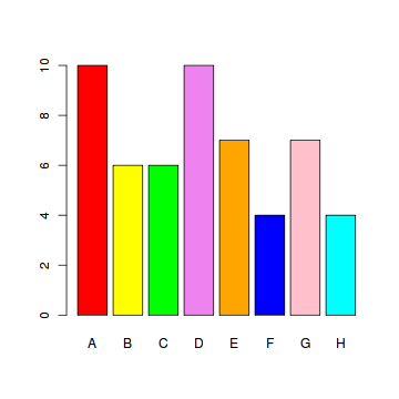
A B C D E F G H
10 6 6 10 7 4 7 4
Relative Frequency Distribution of Qualitative Data, 相对频率分布
The relative frequency distribution of a data variable is a summary of the frequency proportion in a collection of non-overlapping categories.
The relationship of frequency and relative frequency is:
> school.relfreq = school.freq / nrow(painters)
> school.relfreq
school
A B C D E F G H
0.185185 0.111111 0.111111 0.185185 0.129630 0.074074 0.129630 0.074074
> old = options(digits=1) #print with fewer digits and make it more readable by setting the digits option
> cbind(school.relfreq) #cbind function to print the result in column format
school.relfreq
A 0.19
B 0.11
C 0.11
D 0.19
E 0.13
F 0.07
G 0.13
H 0.07
> options(old) # restore the old option
Bar Graph, 柱状图
A bar graph of a qualitative data sample consists of vertical parallel bars that shows the frequency distribution graphically.
> colors = c("red", "yellow", "green", "violet", "orange", "blue", "pink", "cyan")
> barplot(school.freq, # apply the barplot function
+ col=colors) # set the color palette
Pie Chart, 饼图
A pie chart of a qualitative data sample consists of pizza wedges that shows the frequency distribution graphically.
> pie(school.freq) # apply the pie function, 使用默认的颜色

Category Statistics, 按类别分析
对于离散数据, 最常用的就是按类别分析, 比如分析中国各省的评价收入水平, 分析各个年龄层的健康状况
R对此有非常好的支持, 因为对于Dataframe, index实在太灵活了, 很容易生成满足条件的子dataframe
Find the child data set of painters for school C.
> c_school = school == "C"
> c_painters = painters[c_school, ] # child data set
Find the mean composition score of school C.
> mean(c_painters$Composition)
[1] 13.167
Instead of computing the mean composition score manually for each school, use the tapply function to compute them all at once.
> tapply(painters$Composition, painters$School, mean)
A B C D E F G H
10.400 12.167 13.167 9.100 13.571 7.250 13.857 14.000
Quantitative Data
Quantitative data, also known as continuous data, consists of numeric data that support arithmetic operations.
Frequency Distribution of Quantitative Data, 频率分布
The frequency distribution of a data variable is a summary of the data occurrence in a collection of non-overlapping categories.
连续数据怎么分析了, 简单的思路就是离散化, 分区间, 这样就可以和离散数据一样分析了
> duration = faithful$eruptions
> range(duration)
[1] 1.6 5.1> breaks = seq(1.5, 5.5, by=0.5) # half-integer sequence
> breaks
[1] 1.5 2.0 2.5 3.0 3.5 4.0 4.5 5.0 5.5> duration.cut = cut(duration, breaks, right=FALSE) #离散化
> duration.freq = table(duration.cut)
> duration.freq
duration.cut
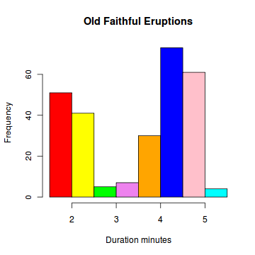
[1.5,2) [2,2.5) [2.5,3) [3,3.5) [3.5,4) [4,4.5) [4.5,5) [5,5.5)
51 41 5 7 30 73 61 4
Histogram, 直方图
A histogram consists of parallel vertical bars that graphically shows the frequency distribution of a quantitative variable. The area of each bar is equal to the frequency of items found in each class.
> duration = faithful$eruptions
> colors = c("red", "yellow", "green", "violet", "orange",
+ "blue", "pink", "cyan")
> hist(duration, # apply the hist function
+ right=FALSE, # intervals closed on the left
+ col=colors, # set the color palette
+ main="Old Faithful Eruptions", # the main title
+ xlab="Duration minutes") # x-axis label
Relative Frequency Distribution of Quantitative Data
The relative frequency distribution of a data variable is a summary of the frequency proportion in a collection of non-overlapping categories.
The relationship of frequency and relative frequency is:
> duration.relfreq = duration.freq / nrow(faithful)
> old = options(digits=1)
> duration.relfreq
duration.cut
[1.5,2) [2,2.5) [2.5,3) [3,3.5) [3.5,4) [4,4.5) [4.5,5) [5,5.5)
0.19 0.15 0.02 0.03 0.11 0.27 0.22 0.01
> options(old) # restore the old option
Cumulative Frequency Distribution, 累积频数分布
The cumulative frequency distribution of a quantitative variable is a summary of data frequency below a given level.
> duration.cumfreq = cumsum(duration.freq)
> duration.cumfreq
[1.5,2) [2,2.5) [2.5,3) [3,3.5) [3.5,4) [4,4.5) [4.5,5)
51 92 97 104 134 207 268
[5,5.5)
272
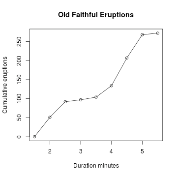
Cumulative Frequency Graph, 累积频数图
A cumulative frequency graph or ogive of a quantitative variable is a curve graphically showing the cumulative frequency distribution.
> cumfreq0 = c(0, cumsum(duration.freq)) #Y轴要加上一个0
> plot(breaks, cumfreq0, # plot the data, 分别事x轴, y轴
+ main="Old Faithful Eruptions", # main title
+ xlab="Duration minutes", # x-axis label
+ ylab="Cumumlative Eruptions") # y-axis label
> lines(breaks, cumfreq0) # join the points, 画条线
Cumulative Relative Frequency Distribution
The cumulative relative frequency distribution of a quantitative variable is a summary of frequency proportion below a given level.
The relationship between cumulative frequency and relative cumulative frequency is:

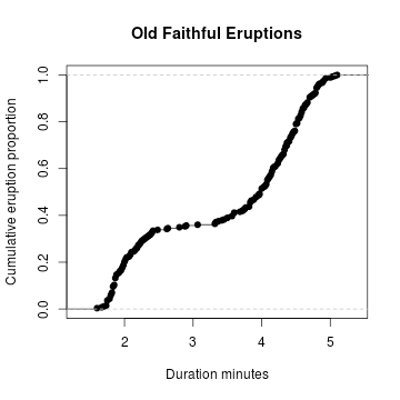
Cumulative Relative Frequency Graph
A cumulative relative frequency graph of a quantitative variable is a curve graphically showing the cumulative relative frequency distribution.
还能这样画,
> Fn = ecdf(duration) # compute the interplolate
> plot(Fn, # plot Fn
+ main="Old Faithful Eruptions", # main title
+ xlab="Duration minutes", # x−axis label
+ ylab="Cumumlative Proportion") # y−axis label
Stem-and-Leaf Plot, 茎叶图
A stem-and-leaf plot of a quantitative variable is a textual graph that classifies data items according to their most significant numeric digits. In addition, we often merge each alternating row with its next row in order to simplify the graph for readability.
茎叶图是统汁、分析少量数据时常用的一种重要工具,它不仪可以帮助我们从数据中获得有用的信息,还可以帮助我们直观、准确地理解相应的结果
当样本数据较少时,用茎叶图表示数据的效果较好,在制作两位数的茎叶图时,是将所有两位数的十位数字作为“茎”,个位数字作为“叶”,茎相同者共用一个茎,共茎的叶在同一行列出,相同的数据也要重复记录.
> duration = faithful$eruptions
> stem(duration)The decimal point is 1 digit(s) to the left of the |
16 | 070355555588 #16.0, 16.7, 16.0, 16.3……
18 | 000022233333335577777777888822335777888
20 | 00002223378800035778
22 | 0002335578023578
24 | 00228
26 | 23
28 | 080
30 | 7
32 | 2337
34 | 250077
36 | 0000823577
38 | 2333335582225577
40 | 0000003357788888002233555577778
42 | 03335555778800233333555577778
44 | 02222335557780000000023333357778888
46 | 0000233357700000023578
48 | 00000022335800333
50 | 0370
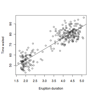
Scatter Plot, 散点图
A scatter plot pairs up values of two quantitative variables in a data set and display them as geometric points inside a Cartesian diagram.
> duration = faithful$eruptions # the eruption durations
> waiting = faithful$waiting # the waiting interval
> plot(duration, waiting, # plot the variables
+ xlab="Eruption duration", # x−axis label
+ ylab="Time waited") # y−axis label> abline(lm(waiting ~ duration))
转载于:https://www.cnblogs.com/fxjwind/archive/2012/02/16/2353919.html
Qualitative and Quantitative相关推荐
- COMP 0137 Machine Vision
COMP 0137作业代做.Python实验作业代写.代做Python语言程序作业.代写Machine Vision作业 COMP 0137 Machine Vision: Homework #1 D ...
- 实现线程哪种方法更好_实施数据以实现更好的用户体验设计的4种方法
实现线程哪种方法更好 Gone are the days when design used to rely mainly on the color palettes and the creativit ...
- 港中文自动驾驶点云上采样方法
点击上方"小白学视觉",选择加"星标"或"置顶" 重磅干货,第一时间送达 Abstract Point clouds acquired fr ...
- Book REPORT:Subject To Change
Book REPORT:Subject To Change 曹竹 Sooner or later, every developer out there gets sick of the long ho ...
- 英文文献中的一些单词
simultaneously 同时 sparsity 稀疏 implementation 方法 Equation 方程式 constraints 约束 The first term ...
- 定位系列论文阅读-RoNIN(二)-Robust Neural Inertial Navigation in the Wild: Benchmark, Evaluations
这里写目录标题 0.Abstract 0.1逐句翻译 0.2总结 1. Introduction 1.1逐句翻译 第一段(就是说惯性传感器十分重要有研究的必要) 第二段(惯性导航是非常理想的一个导航方 ...
- 摘抄 :methodology 怎么写
论文Methodology部分该怎么去写? - 知乎 (zhihu.com) 想要写好一篇methodology,首先要清楚Methodology的概念和目的. Methodology ...
- 超干货 | 硅谷产品大师 Marty Cagan 70 分钟演讲2万字中译
www.pmcaff.com 本文为PMCAFF作者 Adam旺仔 于社区发布 本文来自Marty Cagan去年11月在台湾的演讲视频,视频来源Youtube视频,已被逐字翻译成了繁体.但仍存在差别 ...
- 中文论文万能句型_SCI 论文写作万能句型(每天一点小进步哦)
文献简介 1. Recently investigators have examined the effects of X on Y. 2. In the past two decades a num ...
最新文章
- 西工大计算机专业课考什么,我的西北工业大学计算机考研之路总结
- 【SpringMVC】SpringMVC基础-SpringMVC项目快速搭建、日志框架为logback
- SAP Fiori问题排查:Why expand does not work for complex note
- 爬虫软件python彻底卸载_Python爬虫实践:如何优雅地删除豆瓣小组的帖子
- list python 转tensor_Pytorch--Tensor, Numpy--Array,Python--List 相互之间的转换。
- 【CodeForces - 349B】Color the Fence (贪心,填数)
- python中关于深拷贝和浅拷贝的详解
- Python多进程中多参数问题
- python进阶14文件路径(找不到文件)
- 20165328 第八周学习总结
- Linux新硬盘的使用
- 面试官问:请拿出一段体现你水平的代码时,该如何回答?
- hadoop处理excel数据
- 项目:小型局域网的搭建(基础知识+案例)
- java环境配好后jar文件打开闪退,无打开方式,无反应
- java水仙花数编程_水仙花数java编程实现
- 如何在word编辑文本框,教程来啦,怎样在word编辑文本框
- 艺考生冬日穿泳装秀三围
- python给乘风破浪的姐姐制作词云打call图
- 2048游戏制作html,一个自制的2048小游戏(一)