css硬件加速_CSS动画的硬件加速简介
css硬件加速
In the last couple of years we’ve often heard about hardware acceleration and how it helps to improve animation on web pages, making them nice and smooth even on mobile browsers. But I think a lot of less experienced developers don’t know how hardware acceleration works and how we can use it properly to make our animations shine.
在过去的两年中,我们经常听到有关硬件加速及其如何帮助改善网页动画的信息,即使在移动浏览器上也能使它们流畅流畅。 但是我认为许多经验不足的开发人员都不知道硬件加速是如何工作的,以及如何正确使用它来使动画发光。
The term itself sounds like something overly complicated, close to higher mathematics. In this article, I’ll shed some light on this subject and demonstrate how to utilize this technique in your front-end projects.
这个词本身听起来有点过于复杂,接近于高等数学。 在本文中,我将对此主题进行一些说明,并演示如何在前端项目中利用此技术。
我为什么要在乎? (Why Should I Care?)
Let’s look at a simple animation example containing several balls stacked on top of one another (that is, on the z-axis, so it looks like one ball). The goal is to move this group of balls with animation. The easiest way to do this is to adjust the left and top properties. We could do this with JavaScript, but we’ll use CSS animations instead. Please note that I’m excluding any vendor prefixes but you should use something like Autoprefixer to ensure full compatibility.
让我们看一个简单的动画示例,其中包含多个相互叠放的球(即,在z轴上,因此看起来像一个球)。 目标是通过动画移动这组球。 最简单的方法是调整left和top属性。 我们可以使用JavaScript来做到这一点,但是我们将改用CSS动画。 请注意,我不包括任何供应商前缀,但是您应该使用诸如Autoprefixer之类的名称以确保完全兼容。
.ball-running {
animation: run-around 4s infinite;
}
@keyframes run-around {
0%: {
top: 0;
left: 0;
}
25% {
top: 0;
left: 200px;
}
50% {
top: 200px;
left: 200px;
}
75% {
top: 200px;
left: 0;
}
}
Here is a live demo that uses a button to initiate the animation with JavaScript:
这是一个实时演示,该演示使用按钮来启动JavaScript动画:
See the Pen Animating overlapping balls with top/left Properties by SitePoint (@SitePoint) on CodePen.
请参见CodePen上的SitePoint ( @SitePoint )的具有顶部/左侧属性的Pen Animating 重叠球 。
After clicking the “Start Animation” button, you’ll notice that the animation doesn’t look very smooth, even on a desktop browser. If you test the animation on your mobile device, you’ll see that it’s far from 60fps. To fix this, we can use CSS transform using the translate() function, instead of animating the top and left values.
单击“开始动画”按钮后,您会注意到,即使在桌面浏览器上,动画看起来也不是很平滑。 如果您在移动设备上测试动画,则会发现它与60fps的差距很大。 为了解决这个问题,我们可以使用带有transform translate()函数CSS变换,而不是对top和left值进行动画处理。
.ball-running {
animation: run-around 4s infinite;
}
@keyframes run-around {
0%: {
transform: translate(0, 0);
}
25% {
transform: translate(200px, 0);
}
50% {
transform: translate(200px, 200px);
}
75% {
transform: translate(0, 200px);
}
}
Try the above code in the demo below:
在下面的演示中尝试上面的代码:
See the Pen Animating overlapping balls with CSS transforms by SitePoint (@SitePoint) on CodePen.
请参见CodePen上的SitePoint ( @SitePoint ) 使用CSS变换的Pen 动画重叠球 。
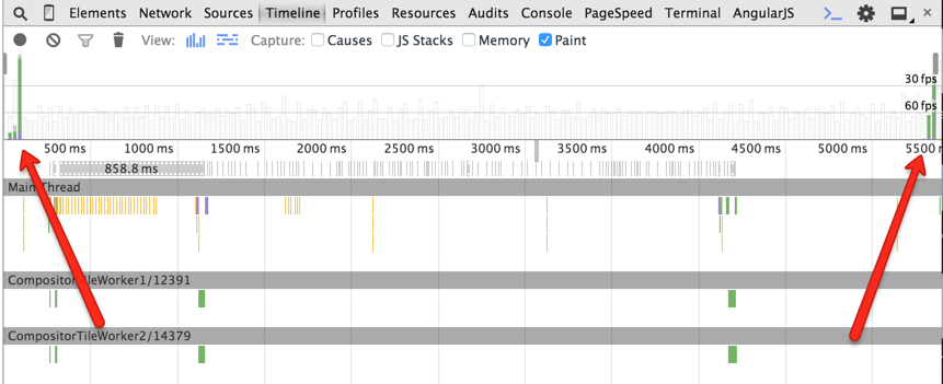
Now the animation is nice and smooth. Great! So why did this help? Well, CSS transforms don’t cause repaints, unlike animations with the left and top properties. Let’s look at the Timeline panel in Chrome’s DevTools during the animation execution:
现在,动画变得流畅流畅。 大! 那为什么有帮助呢? 嗯,与具有left和top属性的动画不同,CSS转换不会导致重新绘制。 在动画执行期间,让我们看一下Chrome开发人员工具中的“时间轴”面板:
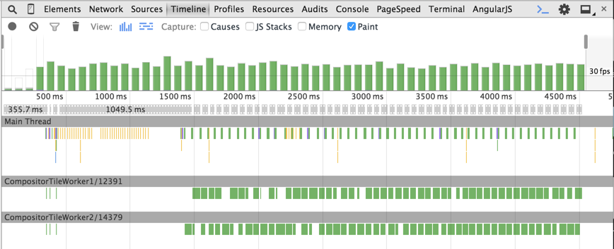
In the left and top example, we can see green bars at each animation step. This is an expensive repainting operation. The animation frame rate is less than 60fps, which we always aim at achieving to make the animation smooth.
在left和top示例中,我们可以在每个动画步骤中看到绿色的条。 这是昂贵的重涂操作。 动画帧率小于60fps,我们一直致力于使动画流畅。
Now look at the timeline in the case of CSS transforms:
现在来看一下CSS转换的时间轴:
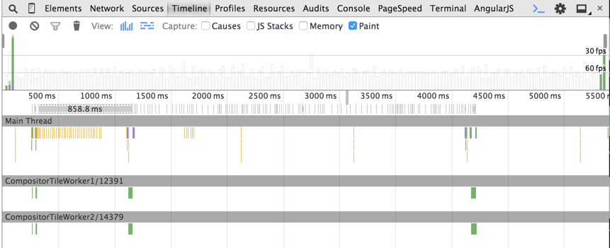
As you can see, there are no green bars during the animation.
如您所见,动画过程中没有绿色条。
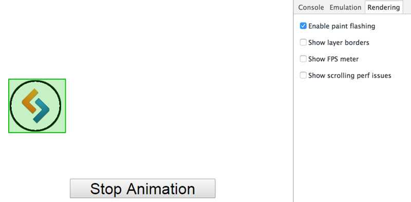
Another feature available in Chrome’s DevTools to track the repainting process is “Enable paint flashing”. You can find this option by opening the DevTools, hitting the ESC key, then choosing the “Rendering” tab. When this feature is turned on, green boxes (i.e. paint rectangles) will appear around repainted areas. In the left and top example, the balls have a green box for the entire animation process, indicating the repaints.
Chrome的DevTools中可用来跟踪重新绘制过程的另一个功能是“启用绘制闪动”。 您可以通过打开DevTools,按ESC键,然后选择“渲染”选项卡来找到此选项。 启用此功能后,重新绘制区域周围将出现绿色框(即绘制矩形)。 在left和top示例中,球在整个动画过程中都有一个绿色框,指示重新绘制。
On the other hand, in the CSS transforms example, the paint rectangle is displayed only on the first and last animation frames.
另一方面,在CSS转换示例中,绘制矩形仅显示在第一个和最后一个动画帧上。
So how exactly do transforms render the animation without repaints? The basic answer is that CSS transforms occur directly in the GPU memory that utilizes hardware acceleration, which avoids software rendering. Let’s look at this in more detail.
那么,变换如何准确地渲染动画而不重绘呢? 基本答案是CSS转换直接在利用硬件加速的GPU内存中发生,从而避免了软件渲染。 让我们更详细地看一下。
硬件加速如何工作 (How Hardware Acceleration Works)
When the browser receives a page’s markup, it parses it to build the DOM Tree. The DOM Tree and CSS allow the browser to build the Render Tree. The Render Tree consists of render objects – the elements to be rendered on the page. Each render object is assigned to a graphic layer. Each layer is uploaded to GPU as a texture. The trick here is that the layer may be transformed in the GPU without repainting, like in the case of 3D graphics. These transformations are made by the separate Compositor process. You can find more information about the composition in Chrome here.
当浏览器收到页面的标记时,它将对其进行解析以构建DOM树。 DOM树和CSS允许浏览器构建渲染树。 渲染树由渲染对象(即要在页面上渲染的元素)组成。 每个渲染对象都分配给一个图形层。 每层都作为纹理上传到GPU。 这里的窍门是可以像不使用3D图形一样在GPU上变换图层而无需重新绘制。 这些转换是通过单独的合成器过程进行的。 您可以在此处找到有关Chrome中组成的更多信息。
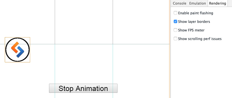
In our example, the CSS transform creates a new composite layer that can be transformed directly in the GPU. Chrome’s DevTools allow for viewing composite layers using the “Show layer borders” option. Each composite layer has an orange border.
在我们的示例中,CSS转换创建了一个新的复合层,可以直接在GPU中对其进行转换。 Chrome的DevTools允许使用“显示图层边框”选项查看复合图层。 每个复合层都有一个橙色边框。
Our balls with the CSS transformation have orange borders and are moved to separate composite layers:
我们CSS转换球具有橙色边框,并移至单独的复合层:
At this point, you might ask: When does a browser create a separate composite layer?
此时,您可能会问:浏览器何时创建单独的复合层?
It does so in the following cases:
在以下情况下会这样做:
- For 3D or perspective CSS transforms (in our example)对于3D或透视CSS转换(在我们的示例中)
For
<video>or<canvas>elements对于
<video>或<canvas>元素- When using CSS filters使用CSS过滤器时
For an element that overlaps another element extracted to a composite layer (e.g., using
z-index)对于与另一个提取到复合层的元素重叠的元素(例如,使用
z-index)
You might be thinking, ‘Hold on. This example used 2D translation, not 3D transforms’. And you’re right. That’s why there are two extra repainting operations – at the start and end of the animation process in our timeline.
您可能会想,“等等。 此示例使用2D翻译,而不是3D变换。 而且你是对的。 这就是为什么在时间轴的动画过程的开始和结束时要进行两个额外的重新绘制操作的原因。
The difference between the 3D and 2D transforms is that 3D transforms make the browser create a separate composite layer beforehand, while 2D transforms do it on the fly. At the start of the animation, a new composite layer is created and the textures are loaded to the GPU, which initiates the repainting. Then the animation is performed by the Compositor in the GPU. When the animation is finished, the additional composite layer is removed, which results in another repainting operation.
3D转换和2D转换之间的区别在于3D转换使浏览器预先创建一个单独的复合层,而2D转换则是即时进行。 在动画开始时,将创建一个新的复合层,并将纹理加载到GPU,从而启动重新绘制。 然后,动画由GPU中的合成器执行。 动画结束后,附加的复合层将被删除,这将导致另一个重新绘制操作。
GPU中的渲染元素 (Rendering Elements in the GPU)
Not all CSS property changes on elements can be handled directly in the GPU. Only the following properties are supported:
并非所有元素上CSS属性更改都可以直接在GPU中处理。 仅支持以下属性:
transformtransformopacityopacityfilterfilter
And so to ensure the best chance for a smooth, high-quality animation, we should always try to use these GPU-friendly properties.
因此,为了确保获得流畅,高质量动画的最佳机会,我们应该始终尝试使用这些对GPU友好的属性。
强制在GPU中渲染元素 (Forcing an Element to Be Rendered in GPU)
In certain cases, it may be required to render an element in the GPU even before the animation has begun. This helps avoid the first repainting operation caused by the new layer creation. To achieve this, the so called “transform hack” may come in handy.
在某些情况下,甚至在动画开始之前,可能仍需要在GPU中渲染元素。 这有助于避免由新图层创建引起的第一次重绘操作。 为了实现这一点,所谓的“转换hack”可能派上用场。
.example1 {
transform: translateZ(0);
}
.example2 {
transform: rotateZ(360deg);
}
What this does is let the browser know that we want to perform a 3D transform. This makes the browser create a separate layer and move the element to the GPU beforehand, thus triggering hardware acceleration.
这是让浏览器知道我们要执行3D转换。 这使浏览器可以创建一个单独的层,并将元素事先移至GPU,从而触发硬件加速。
This technique can also be useful when the repainting of one element is too expensive due to another element behind it. Let’s go back to the first example, and slightly change it so that it contains a single ball and a container with a background image blurred using CSS filters. The ball is animated with the left and top properties.
当一个元素的重新绘制由于其后的另一个元素而过于昂贵时,此技术也很有用。 让我们回到第一个示例,并稍作更改,使其包含一个球和一个带有CSS滤镜模糊背景图像的容器。 球具有left和top属性的动画。
See the Pen Animating a ball with top/left properties by SitePoint (@SitePoint) on CodePen.
请参见在CodePen上使用SitePoint ( @SitePoint ) 用钢笔对具有顶部/左侧属性的球进行动画 处理 。
Again, the ball movement is jerky. This happens because each repainting operation costs too much due to the blurred background.
再次,球的运动是生涩的。 发生这种情况的原因是,由于背景模糊,每次重绘操作的成本都很高。
Now let’s add the transform hack to the container.
现在,让我们将转换技巧添加到容器中。
See the Pen Animating left/top properties with hardware acceleration by SitePoint (@SitePoint) on CodePen.
请参见CodePen上的SitePoint ( @SitePoint )通过硬件加速进行Pen Animating 动画的左/上属性 。
The result is not too bad and the animation works well. Why? Because now the blurred paint-expensive background is moved to another composite layer, and the repainting of the ball at each animation step is cheap.
结果还不错,动画效果很好。 为什么? 因为现在将模糊的绘画昂贵的背景移到了另一个复合层,并且在每个动画步骤中对球进行重新绘画都很便宜。
谨慎使用硬件加速 (Use Hardware Acceleration with Caution)
Nothing comes for free. There are some issues related to hardware acceleration.
没有什么是免费的。 有一些与硬件加速有关的问题。
Memory The most important issue is related to memory. Loading too many textures to the GPU may cause memory issues. This is really critical on mobile devices and can even crash a mobile browser. Mind the consequences and don’t use hardware acceleration for every element on a page.
内存最重要的问题与内存有关。 将太多纹理加载到GPU可能会导致内存问题。 这在移动设备上确实至关重要,甚至可能导致移动浏览器崩溃。 注意后果,不要对页面上的每个元素都使用硬件加速。
Font rendering Rendering in the GPU influences font anti-aliasing. This happens because GPU and CPU have different rendering mechanisms. Thus, even if you turn off hardware acceleration at the end of an animation, the text will be displayed blurred during the animation. You can read more about font rendering issues in this post by Keith Clark.
字体渲染 GPU中的渲染会影响字体抗锯齿。 发生这种情况是因为GPU和CPU具有不同的渲染机制。 因此,即使在动画结束时关闭了硬件加速,在动画过程中文本也将显示为模糊。 您可以在Keith Clark的这篇文章中了解有关字体渲染问题的更多信息。
不久的将来 (The Near Future)
The necessity to use the “transform hack” to create separate composite layers is cumbersome. Browsers should definitely provide a straightforward way to do this. That’s why the will-change property has been introduced. This feature allows you to inform the browser which property is going to change, so the browser can make corresponding optimizations beforehand. Here’s an example that informs the browser that the transform property will be changed:
使用“转换hack”来创建单独的复合层的必要非常繁琐。 浏览器绝对应该提供一种简单的方法来执行此操作。 这就是为什么会引入遗嘱更改属性的原因。 此功能使您可以通知浏览器哪个属性将要更改,以便浏览器可以事先进行相应的优化。 这是一个示例,通知浏览器transform属性将被更改:
.example {
will-change: transform;
}
Unfortunately, not all browsers support will-change. You can learn more about will-change in the following resources:
不幸的是, 并非所有浏览器都支持will-change 。 您可以在以下资源中了解有关will-change更多信息:
An Introduction to the CSS will-change Property by Nick Salloum
Nick Salloum CSS会改变属性简介
Everything You Need to Know About the CSS will-change Property by Sara Soueidan.
您需要了解的有关CSS的所有内容都会更改 Sara Soueidan的财产。
结论 (Conclusion)
To summarize what we covered:
总结一下我们涵盖的内容:
- Utilizing GPU can improve the quality of your animations利用GPU可以提高动画质量
- GPU-rendered animations should be 60fps on every device在每个设备上,GPU渲染的动画应为60fps
- Use GPU-friendly CSS properties使用GPU友好CSS属性
- Understand how to force an element to be rendered in the GPU using the “transform hack”.了解如何使用“变换技巧”强制将元素渲染到GPU中。
If you’ve used these techniques, or have any feedback, please feel free to offer your comments.
如果您使用了这些技术,或者有任何反馈意见,请随时提出您的意见。
翻译自: https://www.sitepoint.com/introduction-to-hardware-acceleration-css-animations/
css硬件加速
css硬件加速_CSS动画的硬件加速简介相关推荐
- 计算机硬件加速怎么开,显卡硬件加速,小编教你电脑怎么开启显卡硬件加速
小编之前是不知道怎么开启显卡硬件加速的,后来是朋友教我,才知道原来开启显卡硬件加速并不难操作.所以今天小编也将者开启的方法分享给小伙伴们.让你们也知道怎么开启硬件加速. 显卡硬件加速有什么作用呢?其实 ...
- 计算机硬件加速怎么开,启用硬件加速是什么 是如何进行的【详解】
启用硬件加速 是什么?简而言之,硬件加速就是利用硬件模块来替代软件算法以充分利用硬件所固有的快速特性.计算机显示使用硬件加速会快些,但会在投影仪或截图时发现显示区是黑的,这时就要关闭硬件加速(硬件加速 ...
- 计算机硬件加速怎么开,怎么开启显卡硬件加速?开启显卡硬件的加速功能步骤...
在我们的电脑中,显卡已经有一定的效能水准,但当我们在开启玩游戏画面或是影音文件时仍然不是很流畅很清晰,这是为什么呢?这就要问你:你使用了显卡硬件的加速功能没有?如果没有使用,那你的显卡就还没有完全发挥 ...
- android开发 硬件加速,Android 开发之硬件加速
(1)定义 所谓硬件加速,指的是把某些计算工作交给专门的硬件来做,而不是和普通的计算工作一样交给 CPU 来处理.这样不仅减轻了 CPU 的压力,而且由于有了专门硬件的处理,这份计算工作的速度也被加快 ...
- android开发 硬件加速,Android开发的硬件加速
说到硬件加快就必需和软件加快一路注释. (1)界说 所谓硬件加快,指的是把某些较量工作交给专门的硬件来做,而不是和通俗的较量工作一般交给 CPU 来处理.如许不光减轻了 CPU 的压力,并且因为有了专 ...
- matlab win10 gpu加速,win10怎么开启gpu加速有用吗 GPU硬件加速设置方法介绍
win10怎么开启gpu加速有用吗 GPU硬件加速设置方法介绍 作为Windows 10的一项重要功能,微软在分享了GPU硬件加速细节后,现在还为大家送上了开启它的技巧,对于中低端设备来说,提升效果还 ...
- 智能硬件市场异常火热 移动互联网公司加速布局智能领域
您好,欢迎来到中国报告大厅! [登陆] [注册] 设为首页 收藏夹 帮助中心 联系我们 快捷导航 通信电脑数码软件 家电日用礼品玩具 医药保键医疗器械 化工塑料纤维石油 涂料橡胶树脂染料 机械电子汽电 ...
- 动画之匀速加速减速缓冲运动(加轮播图)
动画 运动 匀速运动 加速匀速 减速运动 缓冲运动(在某个区间内做减速运动) 封装缓冲运动的函数 需求:当定时器全部清除完时(这里有多个定时器),让元素背景改为red 问题 如何让元素透明也可以运动变 ...
- 5分钟实现漂亮的CSS加载动画,纯CSS实现加载动画
目录 1 视频 2 知识点 2.1 CSS calc() 函数 2.2 CSS var() 函数 2.3 CSS3 box-shadow 属性 2.4 CSS3 box-sizing 属性 2.5 C ...
最新文章
- Yolov4性能分析(下)
- Java中图形界面重绘方法
- 【渝粤教育】电大中专药物分析技术基础 (2)作业 题库
- md5加密算法的C(C++)代码实现
- 真让人捉急:连路都走不稳,怎能号称“仿人机器人”?
- linux的基本命令tail,Linux基本命令(示例代码)
- win10浏览器闪退_win10系统打开ie11浏览器出现闪退的两种解决方法
- 戴尔笔记本重装系统硬盘加密怎么解除
- JPEG与jpg的区别
- 键盘定位板图纸_看看199的机械键盘可以有多酷
- iOS 提交app错误 90096解决办法
- 对人工智能的一点看法
- 十二个“一”的演义小故事
- PaperWeekly 第53期 | 更别致的词向量模型:Simpler GloVe - Part 2
- 【一周搞定计算机网络】计算机网络第5章(运输层)
- jquery设置cursor的属性改变光标的类型(形状)
- Alpha冲刺——第八天
- Mac Outlook左侧文件夹不见了,怎么处理?
- FLASH场景切换代码
- 基于SSM的快捷酒店信息管理系统的设计与实现